A home for cutting-edge experimental features on Google Search.
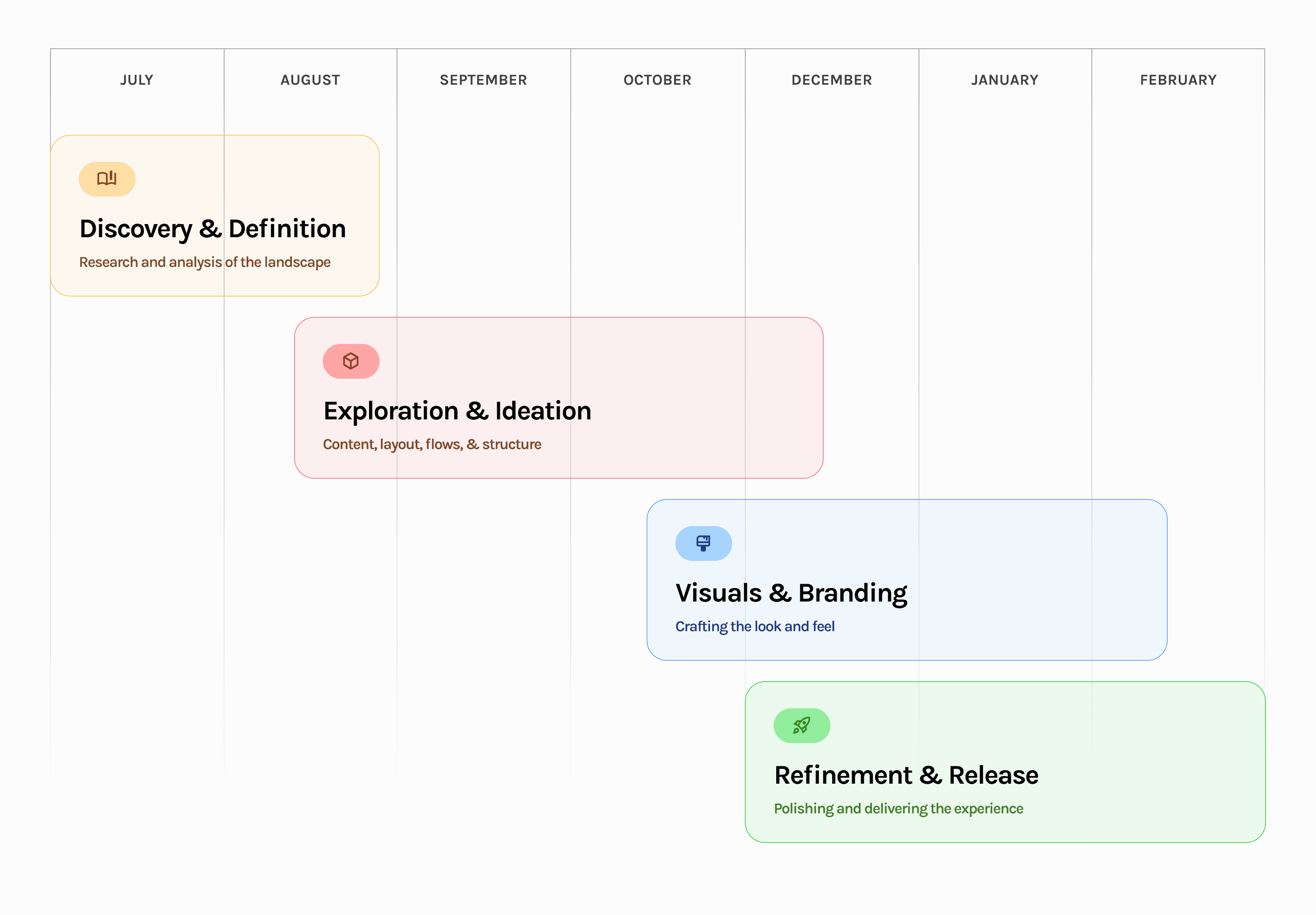
7 months
February 2024
Role: UX Lead
Overwhelming Choice — As Search Labs expanded, it offered more experimental features. Users might struggle to navigate and choose which experiments to try. A clear information architecture and intuitive categorization are crucial.
Unclear Value Proposition — Users need to quickly understand the purpose and potential benefits of each experiment. The onboarding process and feature descriptions must be concise and engaging to encourage adoption.
Managing Expectations — Search Labs deals with experimental features, which might not always work perfectly. It's important to set user expectations and provide clear feedback mechanisms to report issues and contribute to the development process.
Balancing Innovation with Familiarity— Search Labs needs to push the boundaries of search while maintaining a sense of familiarity for users. The interface should be innovative but not jarring, ensuring a smooth transition between traditional search and experimental features.
CHALLENGE
Design principles

PROJECT TIMELINE
SEARCH LABS HOME (OLD)
Challenges in the Lab.
As Search Labs expanded beyond its initial set of experiments, the user experience began to show some cracks. Users encountered hurdles in navigating the growing collection of features, and the interface struggled to keep pace with the platform's evolving nature.
Difficulty exploring and locating specific experiments.
New and relevant experiments not effectively surfaced.
Categorization of experiments was unclear and confusing
Experiment details were often overwhelming and difficult to digest.
Evolving the
Experiment Hub.
To address the challenges of a rapidly expanding platform, the Search Labs redesign focused on creating a more scalable, discoverable, and user-friendly experience. This meant tackling the core issues head-on:
SEARCH LABS HOME (NEW)
SEARCH LABS FEED (NEW)
Improved visual hierarchy and distinct sections for different types of experiments, improving information architecture.
Guides users with a hero carousel and clear visual hierarchy to highlight key experiments.
Sparking Curiosity and Encouraging Exploration.
The redesigned experiment cards in Search Labs aim to capture user interest and invite them to discover the potential of experimental search features.
EXPERIMENT CARDS (NEW)
Driving discovery with eye-catching visuals and concise descriptions that invite users to explore new search possibilities.
Promotes understanding with clear explanations and interactive examples that help users grasp the value and functionality of each experiment.
Encourage engagement with prominent "Try" buttons and a "Feedback" option that facilitates active participation and experimentation.
MANAGE EXPERIMENTS PAGE (NEW)
Provides centralized control by consolidating experiment management into a single, dedicated page, simplifying navigation.
Creates organizational clarity with a clear visual hierarchy, familiar icons, and concise descriptions for easy identification of experiments.
Offers granular control with clear on/off toggles and a consistent "Feedback" option, empowering users to personalize their search experience.
EXPERIMENTAL DETAILS PAGE (NEW)
Reduced information overload by moving detailed explanations and advanced options to a separate page, preventing the main interface from becoming cluttered and overwhelming for users who prefer a simpler overview.
Facilitates informed decision-making by offering users comprehensive information and visualizations to help them fully understand the implications of activating an experiment before they commit to it.
LOOKING AHEAD
What's next?
MEASURING SUCCESS
The "What if(s)?"
While the final product went in a different direction, I still think the alternative designs had a lot of potential. There are some really good ideas here that, with a bit more exploration, could have made the launched experience even better.
ALTERNATIVE DESIGNS
ALTERNATIVE EXPERIMENTAL CARDS, BUNDLED
Project takeaways.
Talking to People — My initial ideas for this came from my own experiences and chats with friends and coworkers. But to really get a good grasp of how people like to use Search, I want to do more user research and talk to actual users.
Fleshing it out — This project was a bit like fixing up an old car – we had to work with some rusty parts and outdated blueprints! There's definitely room to give it a fresh coat of paint and some modern upgrades, which in turn would make the whole experience smoother.
Seamless Integration — Exploring ways to weave experimental features directly into the search experience, could create a more intuitive and unified user journey.


