A refreshed Storefront experience,
enabling users to find & buy games they will love faster.
7 months
February 2022
Role: UX Lead
Poor scalability — The layout and navigation were not optimized for a rapidly expanding game library.
Unintuitive purchase flow — The process of evaluating and purchasing games was not intuitive, hindering conversions.
Hard to discover — Users struggled to find games that matched their preferences, with limited filtering and personalization options.
Mixed pricing signals — Stadia PRO presents users with a separate pricing model, essentially doubling all price displays within the store.
CHALLENGE
Design principles
D-pad first
Prioritize navigation and interactions that feel natural and intuitive for controller users
Scaleable & Flexible
Have a forward-thinking approach that ensures the storefront can readily adapt to new content, features, and user needs
Simplicity & Clarity
Minimize complexity and cognitive load by presenting information in a clear, concise, and easily digestible manner.
Consistency & Familiarity
Using the Stadia design-system, adhere to the established platform conventions to create a predictable and user-friendly experience.

PROJECT TIMELINE
STADIA STOREFRONT (OLD)
Pinpointed issues.
As new titles were added, users faced difficulty navigating the expanding collection, and the homepage's limited space hindered effective content showcasing.
Difficulty in navigating a growing catalog
Limited discoverability of new or relevant games
Lack of clear organization and categorization
Overwhelming presentation of information
Patching things up.
To address the core challenge of a significantly larger game catalog without sacrificing user experience, we need to accommodate future growth and ensure the storefront remains user-friendly as more games are added.
Additionally, we need to make it easier for users to find games that align with their interests, and present information in a clear and organized manner to avoid overwhelming them.
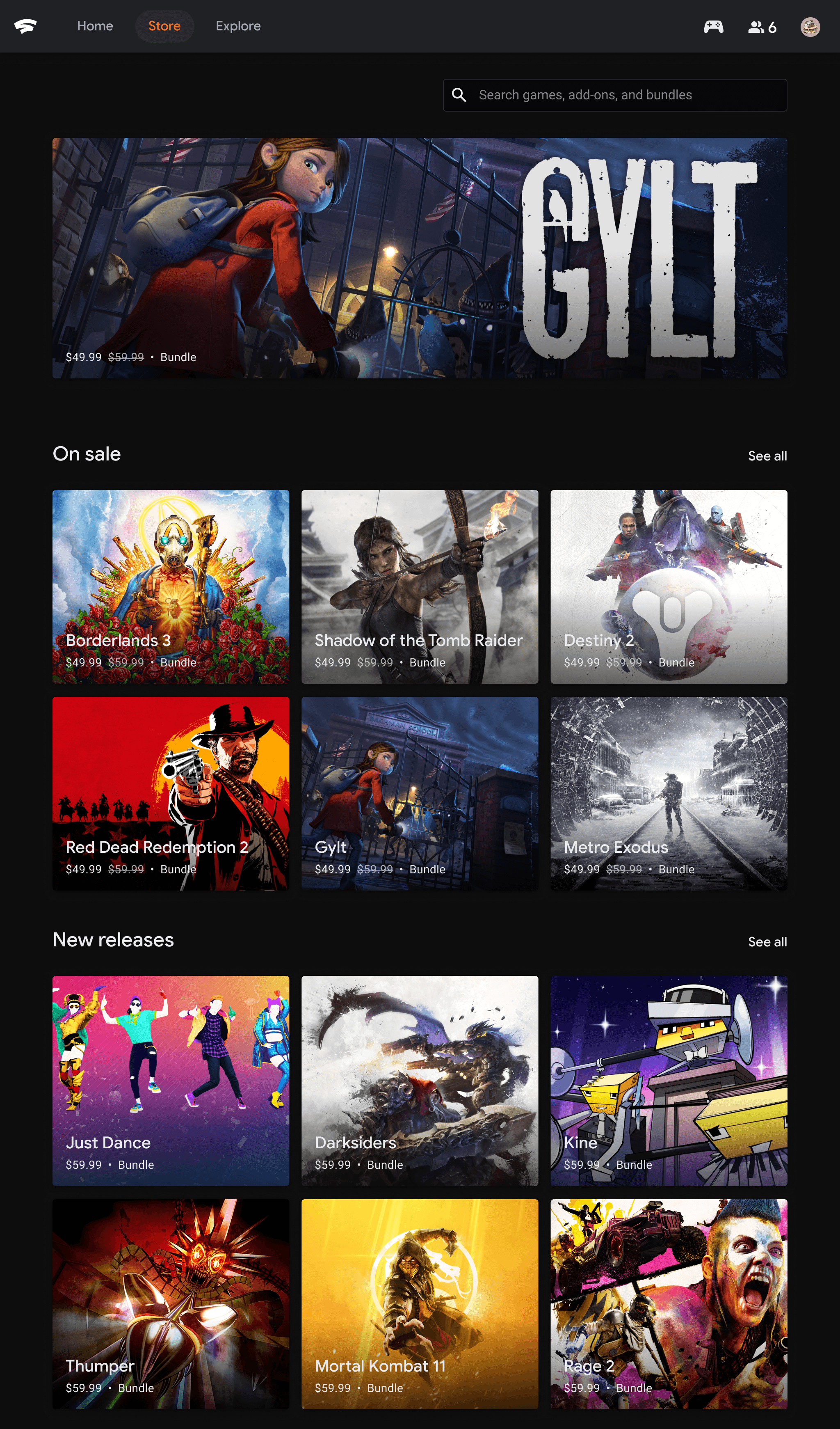
STADIA STORE HOME (NEW)
Improved navigation & layout by implementing new categories & filtering options, and optimized the layout for better content discovery.
Prioritized key content by adding new hero carousel and used clear visual hierarchy to guide user's attention.
Empowering users with Filtered Search.
Introducing a filtered search functionality directly addressed the homepage's limitations in navigating and discovering games within the expanding catalog. By empowering users to refine their search based on genre, price, platform, and other criteria, we transformed a once overwhelming experience into a targeted and efficient process.
This allowed users to quickly narrow down the selection and find games that matched their specific interests, effectively mitigating the challenges posed by the growing library. The filtered search not only improved discoverability but also provided a more personalized and user-centered browsing experience, ultimately enhancing user satisfaction and engagement with the Stadia Store.
STADIA STORE FILTER (NEWLY ADDED)
Overcoming limited browsing by allowing users to actively narrow down the catalog based on specific criteria, going beyond the limitations of pre-defined categories on the homepage.
Targeted discovery by enabling users to define their own discovery path, leading to a more personalized and efficient experience.
Diving deep into the game catalog by getting users to explore titles that might have been buried within the homepage's limited promotional space.
Addressing specific needs by giving users the ability to do things like find games within a certain price range or with specific features, where the homepage's broader categories couldn't.
STADIA PRODUCT DETAILS PAGE (OLD)
Easy navigation.
By implementing a 2 column layout, we were able to address the problems the details page had regarding things like d-pad navigation and poor scalability across surfaces.
GRID LAYOUT
Elevating key pieces.
To make sense of the outdated page structure, I started exploring ways to bring things like the purchase button & title above the fold, which would in-turn help increase game information & purchase conversions.
BUY MENU FLOW
Pinpointed issues.
Elevating the purchase button also helped surface some scalability issues, mainly involving limited string space and potential below-the-fold clipping.
Limited by character count — Game editions with longer character counts would need to be truncated in order to fit the menu.
Buy container clipped below fold — The buy menu would stretch off the screen when a game had too many editions, resulting in a clipped container for some screen sizes.
Patching things up.
To address character count limitations and improve content organization, we created a dedicated section for game bundles. This allowed us to present clear side-by-side comparisons of different editions, empowering users to make informed purchase decisions and ultimately boosting conversion rates.
STADIA PRODUCT DETAILS PAGE (NEW)
Side-by-side comparisons empowered users to make informed purchase decisions when it comes to game editions, bundles & DLCs — ultimately boosting conversion rates.
Repositioned hero media allowing essential game information to take center stage and guide user choices.
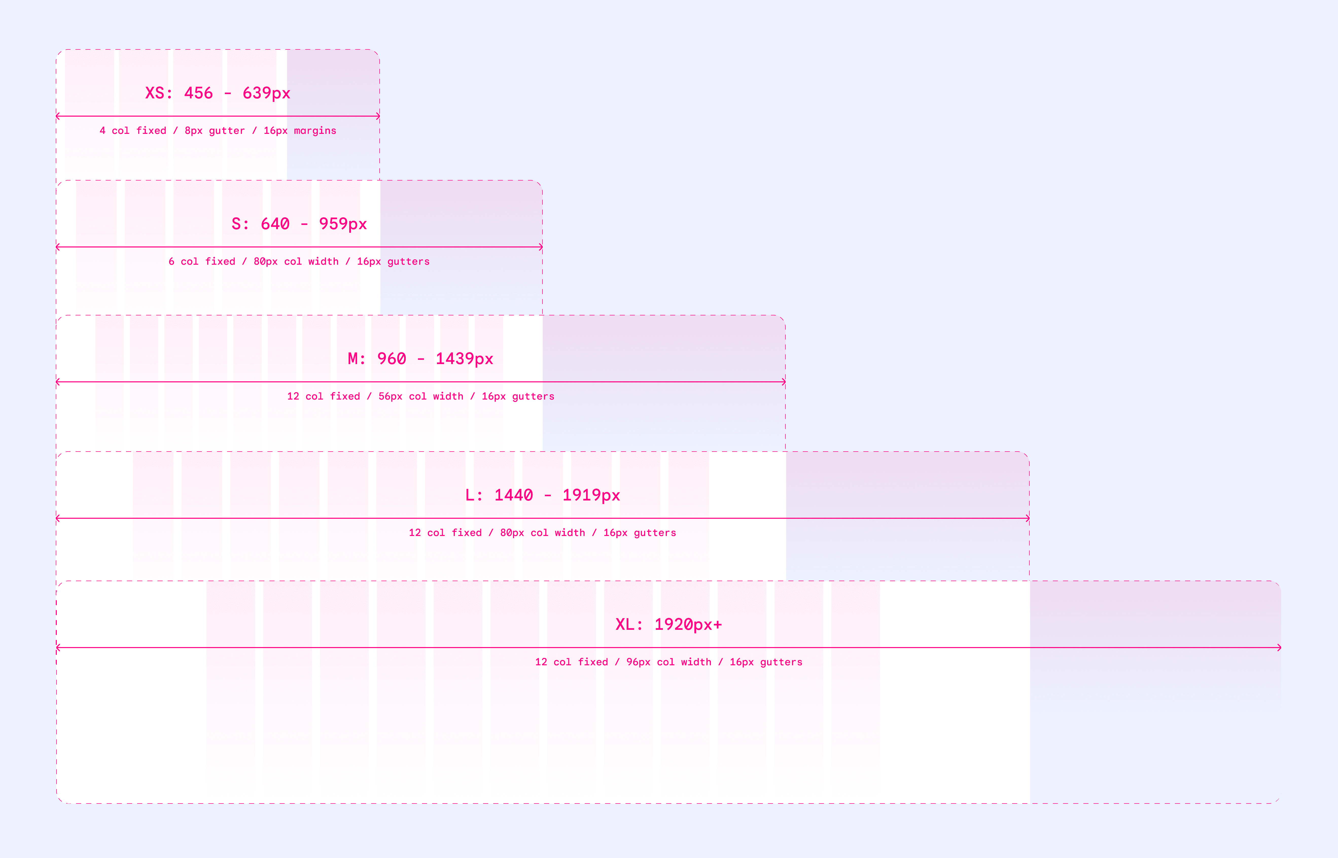
Responsive grid layout.
To ensure scalability and maintainability, we used a standard set of layout grids and breakpoints providing a robust framework for future design iterations and expansions.
LOOKING BACK
Retrospective
MEASURING SUCCESS
REDESIGN ANNOUNCEMENT
Project takeaways.
Influence Through Input — Having to design for d-pad first causes you prioritize clear focus states, minimizing complex input combinations, and optimizing for directional navigation.
The Power of Passive Discovery — Curating engaging content on the storefront homepage can drive "passive discovery," exposing users to games they might not have actively sought out. A balance of active and passive discovery is crucial for a platform with a growing catalog of content.
Scaling with two columns — A two-column layout, while seemingly simple, was highly effective in accommodating the expanding game library. This approach allowed for flexible content presentation and ensured scalability without sacrificing visual clarity.
State-Based Interactions — Leveraging state changes to convey clickability can minimize the need for explicit visual cues like arrows or buttons, resulting in a more intuitive interface, especially for controller users.


